BRAND
Product Item 01
Product Item 02
Customer Testimonial
Newsletter Form
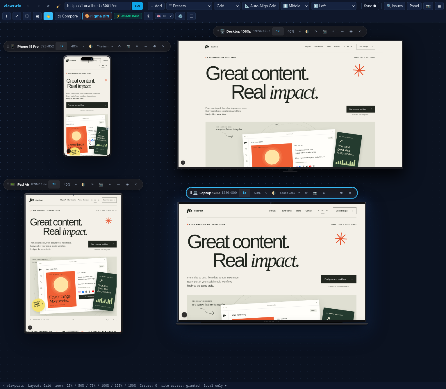
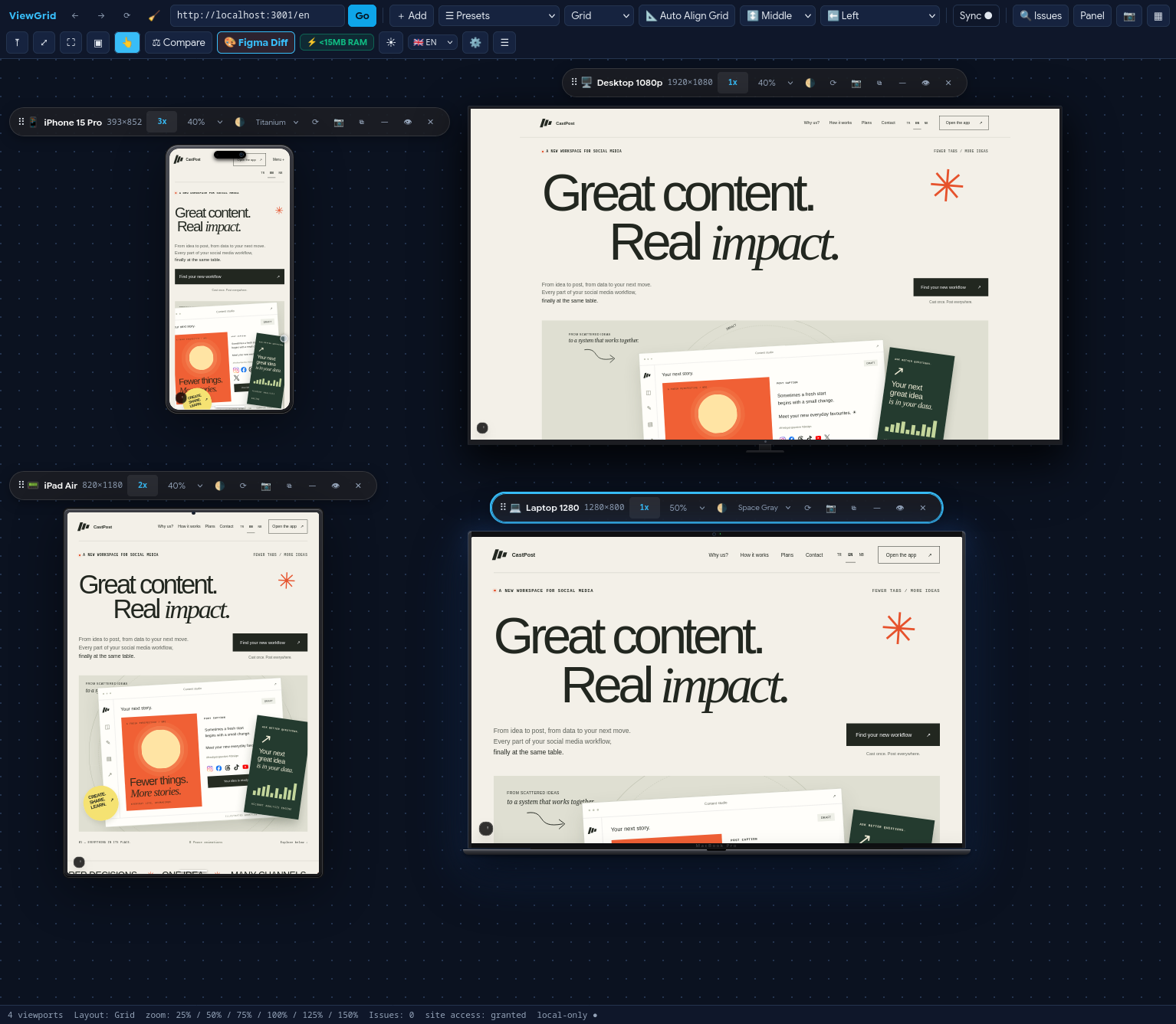
ViewGrid opens phone, tablet and desktop views side by side in one tab, scrolling together so you never miss a broken breakpoint.
Store review in progress — manual install below
Most multi-screen testing tools are bloated Electron bundles or cloud proxies that swallow your machine's RAM. ViewGrid runs directly inside your browser engine with near-zero overhead.
Runs natively inside Chromium and Firefox. While Electron-based tools consume 850 MB to 1.2 GB of RAM, ViewGrid tests multiple breakpoints without slowing down your laptop or battery.
Local broadcast channel mirrors mouse clicks, touch interactions, input forms, and 60 FPS scrolling instantly without feedback loops or frame hitching.
No remote proxy servers, no telemetry, no tracking pixels. Test staging servers, localhost, and authenticated sessions behind VPNs with complete peace of mind.
ViewGrid Workspace
Stop eyeballing padding and font weights. Overlay your Figma mockups directly over live responsive breakpoints to inspect sub-pixel alignment, typography baselines, and element sizing.
Crafting spatial structures with timeless natural materials.
Crafting spatial structures with timeless natural materials.
Drag the split handle or adjust overlay opacity from 0% to 100% to catch minute kerning differences, line-height discrepancies, or 1px margin misalignments.
Load PNG or SVG design mockups directly into any viewport frame as a translucent guide layer while interacting with your live code.
Take screenshot comparisons that designers can verify in seconds. Eliminate endless back-and-forth Slack messages about button alignment and font sizes.
You open browser DevTools, switch to device mode, drag the window handle, and squint at 375 pixels. You fix a broken header on mobile, push your commit, and only later realize that your fix pushed the navigation off-screen at 840 pixels. Nobody has the patience to manually click through eight presets for every CSS change. When you test screens one by one, you miss the transitions where layouts actually break.
One screen at a time. Dragging the window border breaks your focus. You check phone, forget tablet, and miss the mid-tier breakpoint bugs.
Phone, tablet and desktop stay side by side. Scroll once, and all three follow. Layout shifts and alignment bugs are impossible to miss.
Click ViewGrid in your browser toolbar from any tab you want to inspect. A dedicated, distraction-free workspace opens immediately.
Test live production websites, staging links, or your local dev server at localhost:3000. No tunnels, cloud proxies, or server setup required.
Choose standard phones, tablets, and laptops, or specify custom pixel bounds. Flip orientations between portrait and landscape with one click.
Interact with any device. Every other viewport replicates your scroll and click coordinates in real time without feedback loops or echo lag.
Drag the curtain handle below to compare how the layout renders at 375px versus 1280px. Notice where text drops awkwardly or buttons misalign.
Hamburger menu triggered. Navigation collapsed into drawer. Action button full width.
Full horizontal links displayed: Products • Docs • Pricing • Changelog. Sidebar pinned to the right.
Production websites usually send X-Frame-Options: DENY headers to prevent clickjacking. Standard iframe testing tools fail completely and show blank boxes. ViewGrid runs as an audited browser extension, safely stripping these blocking headers strictly for the sub-frames inside your active ViewGrid workspace tab. Your other browsing tabs remain fully protected.
Zero cloud proxy servers. Network rules execute locally in Chromium DNR and Firefox webRequest.
Scroll through the scenarios where ViewGrid replaces manual browser gymnastics.
Write a CSS media query, hit save, and see mobile, tablet, and desktop redraw instantly without touching DevTools.
CSS • Layout TuningRun through a checkout flow or registration form once. Verify input styling across three screen widths simultaneously.
Pre-Flight • FormsCompare Figma breakpoint specifications against live production implementation using the optical split-diff slider.
Figma • Spec VerificationWorks right out of the box with localhost:3000, Vite dev servers, Next.js, Rails, or Docker containers.
Localhost • Dev ServerTake one comprehensive full-canvas screenshot showing your client how their new site responds across all screen sizes.
Exports • Client DeliveryViewGrid is free to install. Everything executes locally in your browser sandbox.
Works in Chrome, Edge, Brave, Arc, Opera, and Mozilla Firefox.


Store review in progress — manual install below
If you prefer not to wait for store registry approval, you can sideload the extension archive directly:
viewgrid-0.1.0-chromium.zip.chrome://extensions in your browser and enable Developer Mode.Firefox users: store installation via AMO is the supported route.
ViewGrid doesn't collect, transmit or store your data. Everything runs in your browser. We have zero servers, zero analytics trackers, and zero telemetry.
Yes. ViewGrid works directly with localhost:3000, 127.0.0.1, internal VPN addresses, and staging environments without requiring reverse proxies or tunnels.
ViewGrid stamps scroll events with sequence identifiers and an active suppression window. When frame A broadcasts a scroll offset, frames B and C apply it without echoing the event back.
Google Chrome, Microsoft Edge, Brave, Arc, Opera, and Mozilla Firefox / Firefox Developer Edition.
Yes. You can capture individual viewports or the entire multi-device canvas into full-resolution PNG files with a single click.